
 - Learn how to create a colour palette with the help of Picmonkey collages, choosing colours and making mood boards!")
Colours are vital when it comes to designing, well, anything and everything. Different colours affect people in different ways, as does their shades and tones, it's all about colour psychology, and what emotions or messages those colours evoke. Take Nellie for example. Grey is quite a calm colour, that gives on the impression of composure and relief, but it can also be an emotionless colour, and doesn't tend to stimulate excitement or energy. Sure, the colour represents me in a huge way, but it can put people off.
If you're not confident in your colour scheme, you're never going to be comfortable.
I've read quite a few interesting posts in finding the right colour scheme or palette for you and your blog/business, and it feels as though everybody and their uncle is creating Pinterest boards for absolutely everything, but for me, I find book covers inspiring in terms of colour schemes and moods. The right colours partnered together can stimulate a whole collection of emotions and feelings, either pulling me towards or pushing me away from picking it up, and rightly so, that's what colour does.
I've put together 10 different colour schemes, all inspired by, or based on book covers, each with their hex colour codes so you can start to create amazing things with those you most like, and at the end, I'll be showing you how to create your own, so stay tuned for that.
1. Shadow and Bone by Leigh Bardugo

Purple: #4e3a56,
Red: #b00f16,
White: #ffffff,
Grey: #403e3a,
Black: #000000
I've always had a soft spot for the special Waterstones UK edition of Shadow and Bone, and nothing against that original, but that purple is absolutely gorgeous.
Accent colours like red evoke excitement, passion, action and power, but can equally feel aggressive, violent and domineering. Purple however can feel creative, fantastical, mysterious and magical.
2. The Rest of Us Just Live Here by Patrick Ness

Grey: #2e3139,
Blue: #28abd6,
#Yellow: fce100,
Grey: #6d6869,
White: #ffffff
Simple illustrated covers are some of my favourite, and The Rest of Us Just Live here balances bold, bright colours perfectly
Blue is typically a calming colour, linked with loyalty, trust and reliability, but can evoke feelings of deceit and sadness, while yellow is often linked to cheerfulness, optimism, wisdom and knowledge, but can be impulsive.
3. Keep the Faith by Candy Harper

Pink: #ec73a8,
Orange: #d05d30,
Lilac: #db3d0f,
Yellow: #ebd672,
White: #ffffff
I'm not much of a pink person, but when paired with more autumnal colours like Keep the Faith, I'm super easily swooned and won over.
Much like red, orange evokes feelings of passion and excitement, but it's also closely linked with being adventurous and socialable, with similarities to yellow also. Pink is seen as with girly, silly, immature and naive, but also love and hope.
4. Life in Outer Space by Melissa Keil

Blue: #68c9cf,
Pink: #dd154e,
Orange: #e45330,
Yellow: #f8e858,
Navy: #01434f
The minute I saw Life in Outer Space, I knew it would be a playful, exciting and fun read. Although I'm yet to read it, the cover speaks volumes.
Associations with colour can change depending on tone and shade, so this hot pink is more playful and exciting than lighter shades, the same as Navy is much more serious and authoritative than light blues, exerting more knowledge and power.
5. Nobody's Princess by Esther Friesner

Dark Brown: #282000,
Light Brown: #95731d,
Dark Green: #384916,
Pale Green: #98b055,
Beige: #cdd0a2
For someone who isn't very outdoorsy, I'm easily taken in by earthy and natural coloured covers, much like Nobody's Princess.
Brown is a favoured colour, linked to stability, strength and nature, but can be seen as cheap and dirty. Green has similar links to nature, but is more closely associated with wisdom, wealth, cowardice, and confidence depending on the tone and shade.
6. Mortal Coil by Derek Landy

Black: #000000,
Yellow: #feeb00,
Orange: #dc440d,
Peach: #ee7d26,
White: #ffffff
Mortal Coil is my favourite of the Skulduggery Pleasant covers, and for good reason, the colors speak volumes for the story.
Not all colours are chosen out of their positive meanings, but for their negatives. Black is typically linked with mystery and uncertainty, yellow with deceit, orange with being superficial and selfish, and white with emptiness and detachment. Those who've read Mortal Coil understand those colours.
7. Heir of Fire by Sarah J. Maas

Dark Green: #007046,
Yellow: #f4ea54,
Blue: #00748c,
Grey Blue: #4a5265,
Pale Blue: #b8d5d7
Heir of Fire is my next read of the Throne of Glass, but it's choice of colours on the cover that excite me most.
We've already seen how green is linked to wisdom and wealth, and blue to calmness or power, but indigo evokes feelings of spiritual knowledge, restructuring and inner awareness, of a greater power, mimicking the values of purple and blue.
8. Uprooted by Naomi Novik

Beige: #f2eee5,
Brown: #b5935c,
Indigo: #412f5d,
Light Blue: #92c3bb
Uprooted is another simple illustrated cover that creates shadow and balance with only four colours, beautifully.
Taking into account what we know about these colours already, Uprooted uses indigo (spiritual knowledge and power) to cast shadows over a small brown (nature, dirty, cheap) house, which tells you a lot about the story itself before you start reading. Placements of colours is just as important.
9. All The Bright Places by Jennifer Niven

Blue: #5294c9,
Light Blue: #dee9ee,
Pale Yellow: #fcf5a2,
Beige: #f5ebeb,
Purple: #785178
Now that I understand colours and their meanings, All The Bright Places makes me feel rather sad..
Blue, as we know, evokes feelings of sadness and depression, while purple is linked with feeling of mystical, magical and grand emotions. The pale yellow is linked to lack of confidence or need for reassurance. Will all this in mind, how happy do you think this book is likely to be?
10. Balzher by Meg Wolitzer

Black: #000000,
Dark Grey: #2f2f2f,
Light Grey: #aeaeae,
White: #4ffffff,
Yellow: #f8f005
Belzhar was, and always will be a favourite read of mine, as will the cover, not only because it's gorgeous, but how it speaks to me.
Blacks, whites and greys all evoke feelings of isolation, a fear of the unknown and a hollow, emptiness. Belzhar explores these, but the yellow and it's wisdom, it's knowledge, it's optimism and new beginnings, hints to a lesson learnt.
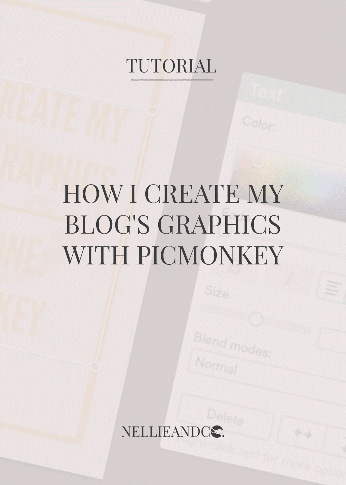
How To Create a Colour Palette Board With Picmonkey
Ah yes, this is the fun part, creating your own. It's actually not at all difficult to do, but now it's even easy with one of Picmonkeys new feature updates for their collages. By now you know the drill when it comes to Picmonkeys homepage, so get started by choosing collage. You'll then be asked to choose an image (or 5, but you can stick to one for now) to begin with.
For this example, I chose The Creeper Man by Dawn Kurtagich.

First things first, we've got to create more cells to create a better palette, so go back to your image in the sidebar, which you'll now see has a small tick in the bottom left-hand corner. Click and drag the image again and hover it between the two cells you already see, and you'll see a faint blue box appear between the two. When you see the box, drop the image and it should create another cell with the image in. Hover over that second image and you'll see a cross in the top-right corner. Click it and the image will disappear, but the cell will stay. Repeat this step until you have the number of cells you want; I did this step three times for 5 cells.


Now that you've got 5 cells, it's time to take colours from the image and use them to colour the cells. In your left-hand sidebar, you'll see a painters board, click on that icon and you'll see a new sidebar appear. Down at the bottom of this new sidebar, you have two options, background and cells. Click cells and then look for the little tippet-like icon just underneath 'Cells' and then move your cursor over to your image. You'll see the little box in the sidebar change colour depending on where your cursor is. This is how you'll choose your colours from your image and add them to the cells.


With the help of your tippet, choose a colour from your image and click your left mouse button once. Your cursor will change from a tippet, to a paint bucket similar to you'd find on Paint programs on Windows systems. Choose a cell and left-click your mouse to fill the cell with your chosen colour. Tadah. Magic. Repeat this step will as many colours as you want, adding them to each cell to create a colour palette.

There you have it. Your very own, handmade colour palette, created by your own fair hands, completely free, no silly purchases or downloads required. You can use this method to create full on board inspirations for decorating, with different images, different patterns and choosing your colours to decorate with. It's just another super awesome free tool from Picmonkey to help you be the best creator and designer you can be.
Do you think you'll ever use this Picmonkey feature?
Which is your favourite palette of those featured, and why?
Want to learn about Picmonkey and what else it can do for your and your blog? Check out these posts!

I LOVE COLORS!! So these are all just beautiful to look at. :) Great idea!
ReplyDeleteThanks so much Stephanie! It was certainly a fun post to put together :D
DeleteI love color palette boards like this because it's always so surprising to me to see what colors go together. I mean, the colors are there when I look at book covers or photos, but I never really think about the individual colors until I see them laid out like this. And it's always colors that I never would've thought to combine. Plus, as was mentioned above, they're just beautiful!
ReplyDeleteAw, thank you Kristen! I definitely feel the same, some of the colours just make you think 'whaaaaaaat' but they just go so well, and this really shows that :)
DeleteI never knew PicMonkey had this feature! I'll probably play around with it for a bit, but I probably won't use it much. Still, thanks so much for sharing - it looks so fun, and now I know how others do it! :D
ReplyDeleteVery true, it's not a feature you'd use all the time, but it's definitely a fun one :)
DeleteThis is so cool Amanda, I love what you've done with the colour palettes for these covers - they're wonderfully complimentary and your analysis of colours as well! Super fascinating and thanks for the tutorial as well!
ReplyDeleteThank you so much Jeann! At least now it could be great for branding or designing :)
DeleteGreat post! I really like the Life in Outer Space, Uprooted, and All the Bright Places ones. Bec and I were actually just recently looking at the covers of book covers in hope it would inspire a new color scheme for the blog!
ReplyDeleteThanks Alise! I really like your design as is, but hey, nothing wrong with looking is there ;)
DeleteOH MY I LOVE THESE THEY'RE SO PRETTY. I had no idea this could be so simple -- totally making one sometime. Lovely examples + tutorial, Amanda!
ReplyDeleteGreat for creating mood boards and even aesthetics too, so it's worth knowing. Thanks Alyssa! :D
DeleteI love the Nobody's Princess palette! I couldn't figure out why that one jumped out to me so much, then I realized that's pretty much the exact color scheme I used to decorate my house. I saved the pic to my desktop to use as a decorating reference later! :)
ReplyDeleteAw, thank you Alison! I really like that palette, it's definitely a fave combo! :)
DeleteLove this idea! I love how you made a tutorial to show others how to make them too.
ReplyDeleteIt's actually a good way to find inspiration for blog design colours. :)
Thanks Chrystal! I'm all about teaching others my tricks of the trade :D
DeleteNice! I do something similar for my Color Covers feature, but I use Powerpoint. I just love tooling around in PPT for some reason haha. I set up little boxes next to the cover and use the eyedropper to fill them up. I actually did one for All the Bright Places too! (Currently scheduled to post sometime soonish on my blog ;))
ReplyDeleteThanks Lauren! I like your Color Covers feature and think it's really nice to check out. Keep it up though, it's one of my favourites of yours :D
DeleteTHESE ARE ALL ABSOLUTELY BEAUTIFUL! URGH. TALENT. I adore Picmonkey, and I can't believe Picmonkey can do this! *cue squeals* THANKS FOR SHARING THIS!
ReplyDeleteThis comment has been removed by the author.
ReplyDeleteVery useful blog post!!!
ReplyDeletetop analytics companies
Granular data
top analytics companies
Analytics Platform
Analytics for FMCG
Analytics for financial products
Such a very useful blog. Very interesting to read this blog. I would like to thank you for the efforts you had made for writing this awesome blog.
ReplyDeleteartificial intelligence internship | best final year projects for cse | internship certificate online | internship for mba finance students | internship meaning in tamil
Nellie And Co.: 10 Colour Palettes Inspired By Young Adult Book Covers (+ How To Create One In Picmonkey!) >>>>> Download Now
ReplyDelete>>>>> Download Full
Nellie And Co.: 10 Colour Palettes Inspired By Young Adult Book Covers (+ How To Create One In Picmonkey!) >>>>> Download LINK
>>>>> Download Now
Nellie And Co.: 10 Colour Palettes Inspired By Young Adult Book Covers (+ How To Create One In Picmonkey!) >>>>> Download Full
>>>>> Download LINK s0