
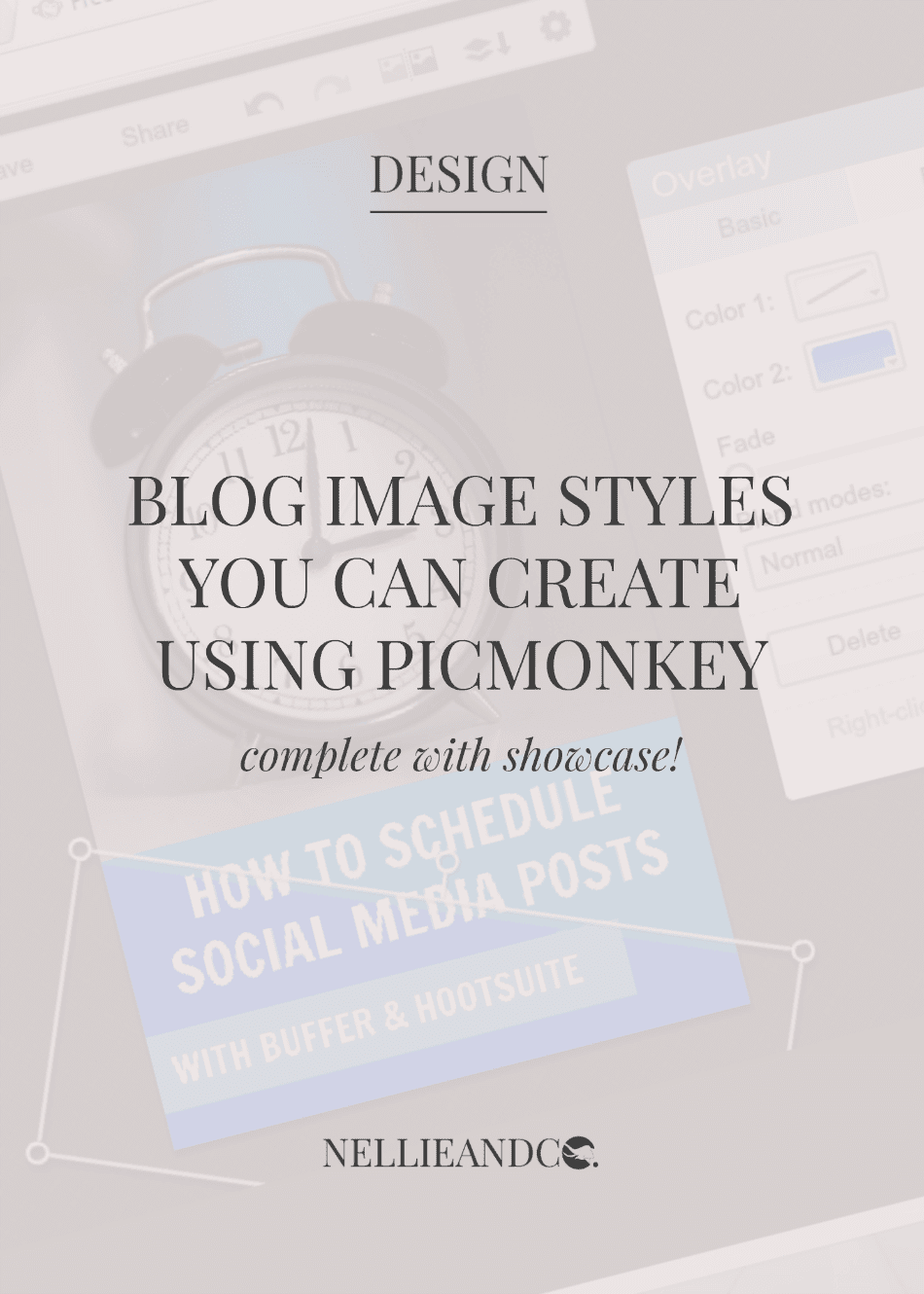
Blog graphics are super important. They play a huge role when it comes to your blogs design, but more than ever, they're extremely important for use in social media. A picture tells a thousand words, and when you're an introvert like me, that's not only clever, but a life saver. But a bad image can say just as much, if not more, about you, your blog, your brand, your business even, than a good one, and that's why creating the perfect blog graphic sounds tough. I'm here to tell you, it isn't.
I'm a sucker for an attractive image just as much as the next girl, but I'm so attracted to them, I've been checking out Pinterests vast collection of graphics to find you the 5 biggest and most popular styles around, and I'm going to show you how you can create them, completely free, no experience required, with Picmonkey, one of my favourite blogging resources I can't blog without.
The 'Say It As It Is' Graphic
This is without a doubt the easiest of blog graphics to put together. Simply open Picmonkey and choose your desired image size. I would recommend 4x6 or 5x7, but most definitely choose something has some length to it, you want your graphics to be tall rather than wide.
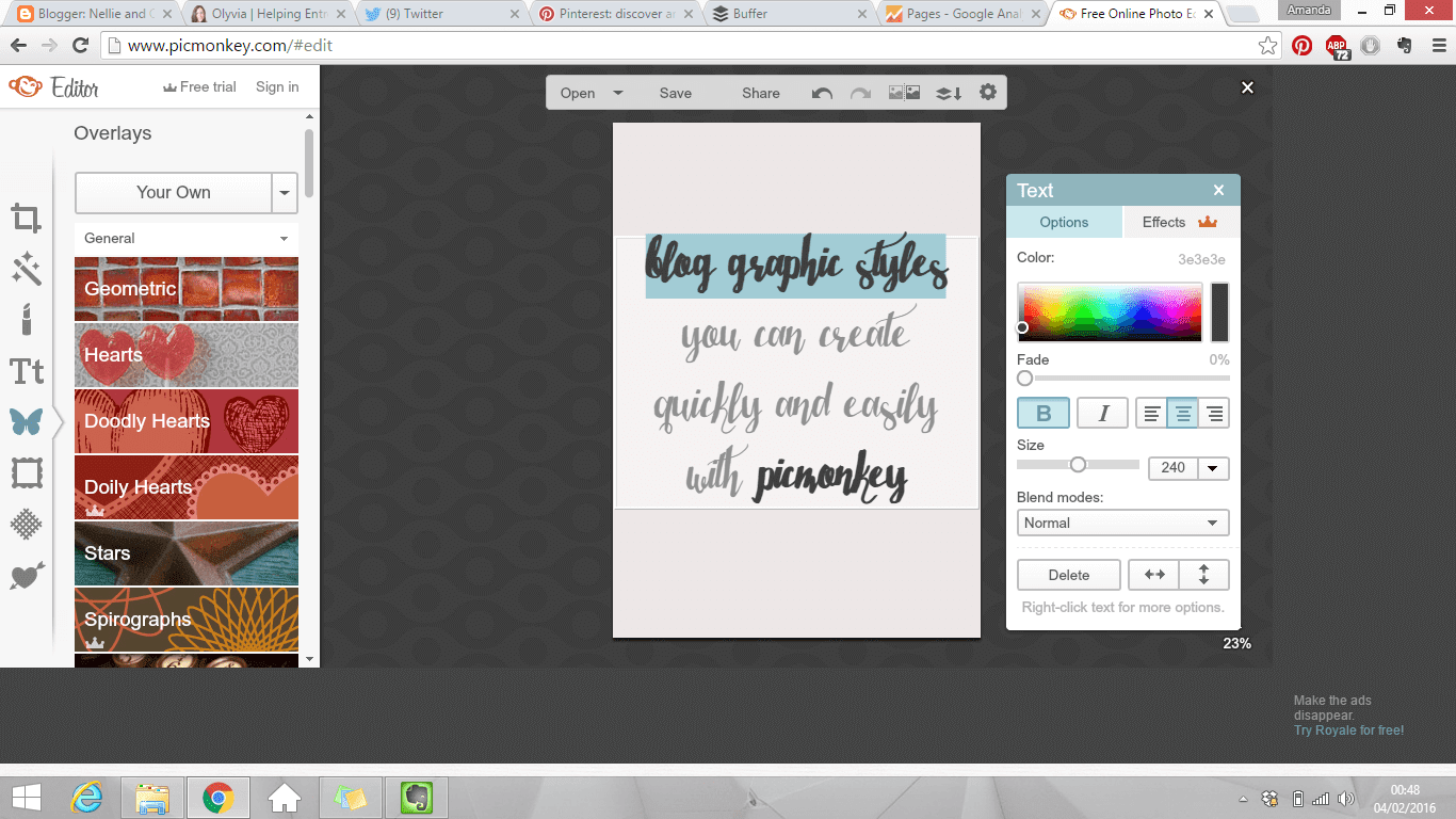
This type of graphic, in it's simplest form, involves using one font, one or two colours for your fonts, and a plain, one tone background. It's simple, it's quick and there's absolutely no reason anyone can't make a graphic like this. You could then later spice it up with a switch in colours, and maybe add some extra details to the graphic to make it less, sparse. Without a doubt, this is the simplest.
The 'Boxed In' Graphic
My previous Picmonkey graphics contained a mixture of this style, and the first, and for a full, in depth look at how those graphics were created, you can check out this previous tutorial for more information. For the sake of this post though, we're going to go quick and easy and cut out the extra little details.
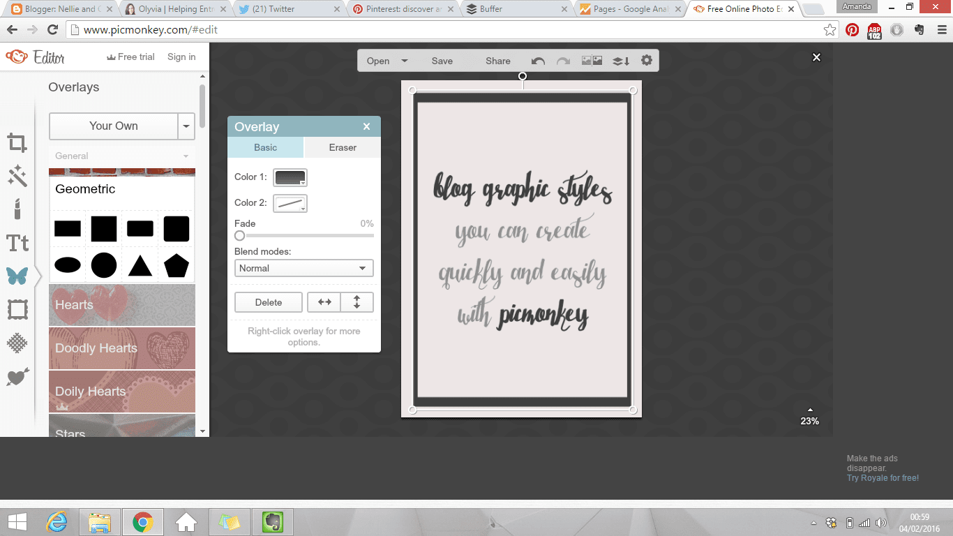
The boxed in style is as simple as it sounds. It's just a box around your content, leaving white space available around your box, and within your box around your text. Switching up and out the colours you use could make a big difference in terms of standing out, but this is also one of the more simple and quickest of the styles to create with little to no effort.
The 'Whitespace' Graphic
One of the more popular styles currently is the whitespace, and it's no difficult to think why. Take a pretty image (with permission of course!) with some room for some text and bam, quick and easy graphic in seconds. Here's a quick run down on how to achieve it.
First, either use your own photos, or seek out some freebie stock photos, but whatever you do, don't use Google Images unless you specify a search through Search Tools > Usage Rights > Reuse with Modification, but I would recommend free stock images over Google Images every time. Then, upload your image and get to work adding your text into the free whitespace available.
When it comes to these graphics, it's always best to seek out photos that match your brands colour and style. There's nothing worse than a bright pink photo on a monochrome design. Same applies to your fonts, make they either match the photo you're using, or your brand colours, or both. It's not just bad, it's shocking, but general common sense should stop you making that mistake.
I used to create blog graphics using this style through Canva, which I also wrote a tutorial on, so if you want to know how to achieve it with Canva, take a look at that post too.
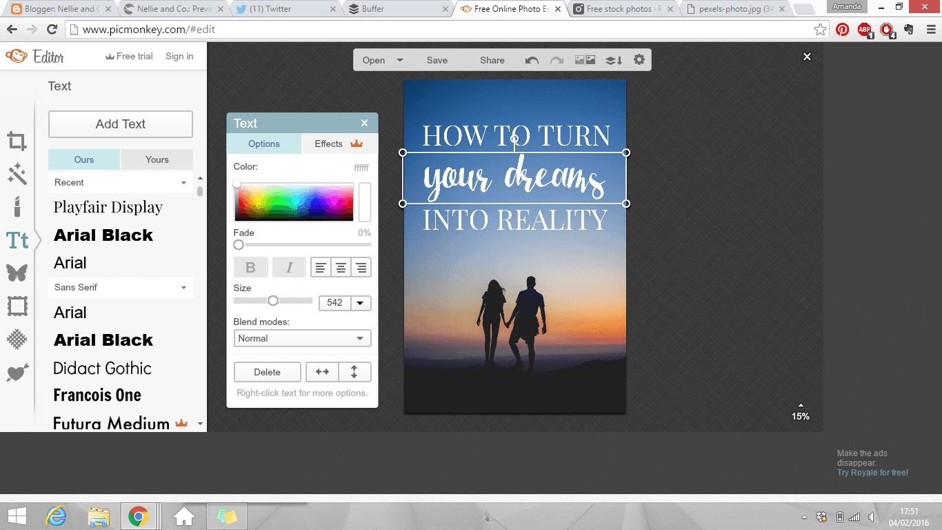
The 'Partial Overlay' Graphic
This style has been around for quite some while, and it's definitely not going away any time soon. The partial gives you the style of the whitespace, with the benefit of having more room for your text due to being able to cover up some of the background image.
Once again, common sense comes into play here in terms of brand colours and fonts, but the colour of your overlay also matters, as does your level of transparency. Some decide to go for the block colour, none transparency overlay, and when you use your brands colours, you can rock this look big time. Some decide to go for the slight transparency look which lets some of your image show through, while dulling it enough for your text to be readable. Some go for a mixture of the two, and almost all of these graphics work.
More skillful designers, or those with more time will choose to put more effort into these types of graphics to find the right balance between colour, style, transparency, where to add the details and when to leave well alone. These types of graphics take practice, patience and perfect pairings to look effective, but when done well, they're beautiful.
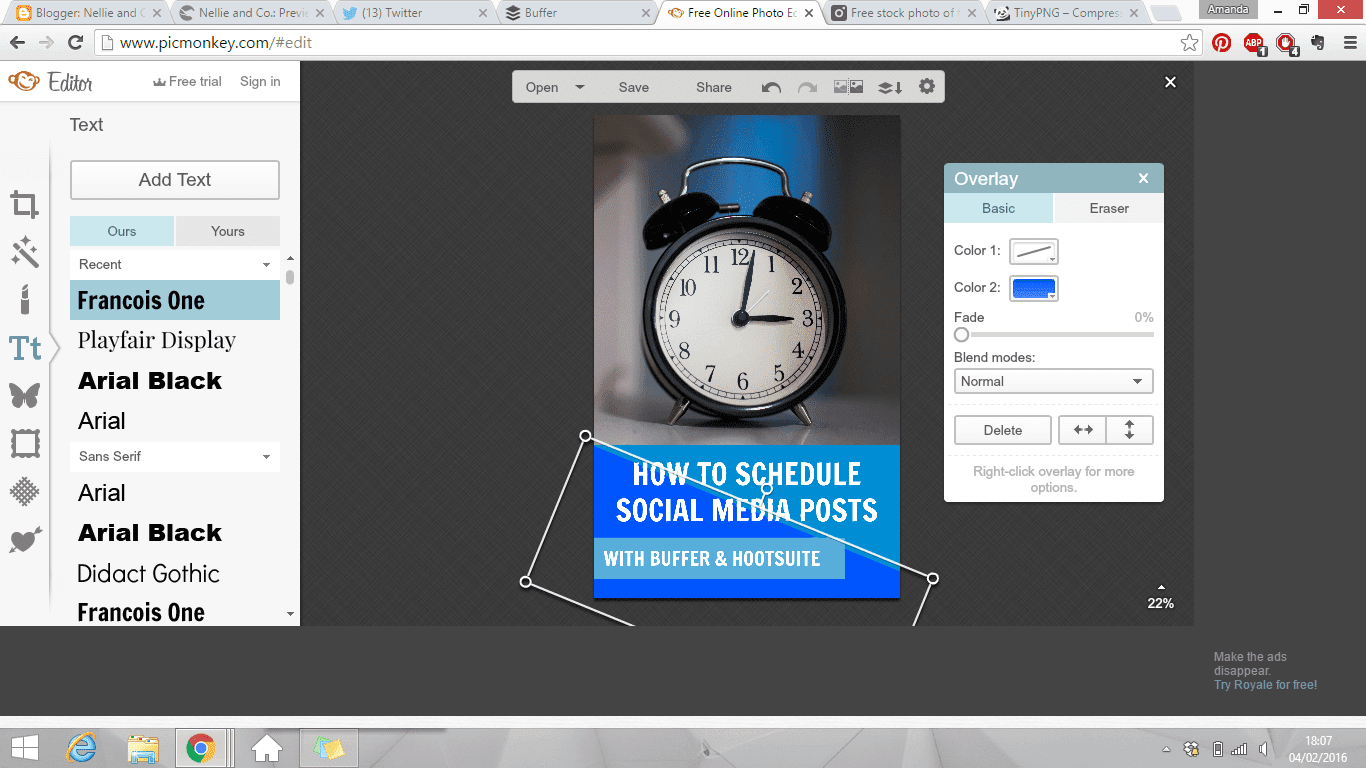
The 'Complete Overlay' Graphic
This is the style I've recently chosen to adopt within my own graphics, and it's also used almost all over the book blogging community as a way to showcase their photography. This method is great in that you can choose any level of transparency to cover the entire image, but once again, common sense plays a huge part in colour schemes, font choices and so on.
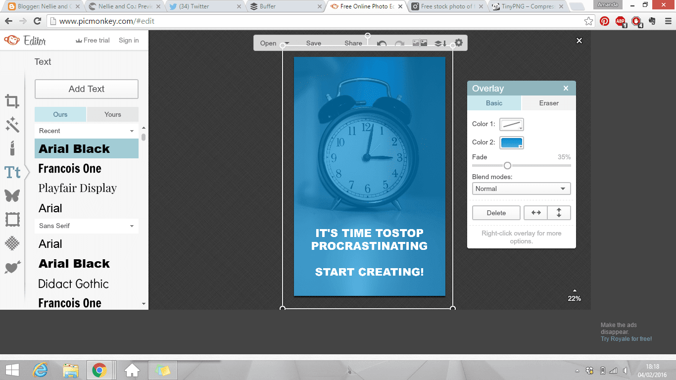
Some designers choose to add little details to these overlay styles, choosing to use shapes as their overlay instead that meet, creating a two-tone overlay, while others will opt for a full length, one colour overlay, like myself. Some will choose to have the overlay rather weak, showing the background image quite clearly, while others will choose to have the overlay quite strong, creating more of a subtle background that is mild and non interfering, like my own.
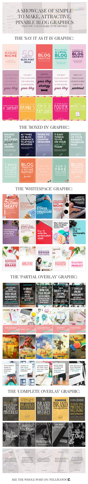 The examples you've seen above took me less than 15 minutes to create in total, including searching for the graphics. Each graphic took me around 5 minutes to throw together, but as you can see, they don't exactly scream 'read me!' That's because crafting and creating the perfect graphic takes time and practice, and sometimes, it takes a few extra minutes or hours to get the details just right, and oh what a difference time can make.
To show you just how important time practice, patience and persistence are in terms of creating these important aspects to our blogs, I've created a showcase of some of my favourite graphics from bloggers I follow and admire that use these styles, and use them superbly.
As you can from the first collection, the simple graphics can actually be made to look super attract by using a variety of colours in the fonts, a variety of fonts, size of fonts, and even adding in little details like KristaRae does around her borders. It's easy to see how simple graphics can get a message across, and they're quick to put together.
In the second collection, boxes and borders can be rather professional looking and help keep different aspects in the right ratio with one another. In Garnishing Co's graphics, she uses the same border style in all her graphics, which compliments her brand and makes her images part of her design.
The third collection is the type you see more than any others, and it's usually deemed much more feminine and pretty than the others because of the flat-lay designs and balanced look it creates. It also allows for a blogs branding to continue through it's graphics by use of coloured props that match their brand. It's clear to see in Elle and Company's graphics that she's going for a relatable, feminine and organised working woman look, and it matches her brand and mission completely.
The fourth collection goes to show how much variety there is in terms of the partial overlay style. There are almost full image overlays like By Regina's, or only slight overlays like Go Creative Go's, and the style of overlay works in conjunction with the design of somebody's blog and their brand. Some are simple, some are more creative, some use the image as the focus, while others use them as the background. No matter the style you choose, it's easy to create and once you have a template, it takes to time at all.
The last collection is of course the full overlays and almost always uses the image or pattern as a background image. Personally, I choose this style because I've gotten back into photography, but I'm hardly a professional, and so by keeping it only slightly visible, I can hide imperfections. Complete were the more popular type of graphic until the last year, but it's still one of the easiest types to create.
Hopefully by seeing the different types of graphics you can create, and just how easy it is to create these with Picmonkey, you'll be excited to try out your own. Feel inspired by what you see around you, but also don't settle for the first type of graphic you make. Finding your perfect style takes time, a lot of practice, and what you like today, you might not like tomorrow, so experiment and explore the options until you find the one that works with your design, your brand, and your personal style.
Remember that images are now, more than every, extremely important, and the more attractive and sharable your image is, the better results you'll receive. It's time to start creating.
I love your graphics tutorials and I really need to start using them because I desperately want to incorporate graphics into my posts!
ReplyDeleteAw, thank you Lara! Using your book photography would be a great way to create your graphics ;)
DeleteOh wow, Picmonkey looks SO versatile. I started using GIMP from like a really long time ago so I've never had the desire to change, but I had no idea this was such a fantastic tool! I mostly use either of the overlay graphics, especially since I'm taking more of my own photos now. This is a really great roundup, thank you!
ReplyDeleteI do find that Picmonkey is pretty versatile, even with it's small issues. When you know it's secrets, it's rather amazing, so hopefully you'll give it a try. You're welcome :)
DeleteI love picmonkey but at the moment i'm finding it so slow and lagging; it's almost unusable. Is it just me?
ReplyDeleteEliza | www.lipglossandpaperbacks.blogspot.co.uk
It's not usually slow and lagging. It could be an issue with cookies, or the ads they have slowly down your overall usage. It may be worth getting an adblock feature on your computer to hide the ads they show, which may make it quicker for you, playing with your cookies, or doing a general clean up of your internet browser :)
DeleteI absolutely love this post! This makes me a lot more confident to use PicMonkey for future use.
ReplyDelete-Poulami @ Daydreaming Books
So pleased Poulami, thank you for your kinds words! :)
DeleteI really love the one you're doing now, with the photos and overlays and it all being rather demure in colour. Somehow it's just very aesthetically pleasing?!? ;D But these are great tutorials! I LIKE.
ReplyDeleteOh I'm so happy Cait, I was afraid it would look a bit, doom and gloom, you know? A bit too none colourful. Aesthetically pleasing is pleasing though, so thank you! :D
DeleteOne of my blogging goals this year was to work on my designing and to practice making prettier graphics. This is definitely a helpful post that I plan to use in practice really soon *saves*
ReplyDeleteAw Mel, that's a great goal! Really hope it works for you and this post is helpful :)
DeleteThanks for the tutorial! Very useful. I used the Partial Overlay Graphic in my post on the Emmys, which you can see here on my website/blog justsewcris.weebly.com. I think it came out nice. What do you think?
ReplyDeleteplease enter the link . If you need any brochure design please contact us
ReplyDeleteSnappa's drag-and-drop editor, it’s quick and easy to create your own graphics for blog posts, social media profiles and ads. The tool provides access to more than half a million free stock photos, 70,000+ vectors and shapes, and 200+ fonts. It's free to download up to 5 files per month, or $10 a month for unlimited downloads.
ReplyDelete